Hiding (or Enhancing) Glue Lines in a Table Leg
A little careful craftsmanship can make glue lines look good — or at least not look bad. July 29, 2011
Question
I used two pieces of 8/4 stock for some legs on a butcher block table. Legs are 3 1/4" x 3 1/4". Is there an established method for glue joint placement of the leg? Do I want to see the glue joint on the long side of the table or the short side? If you enter the kitchen, you see the short side first.
Forum Responses
(Furniture Making Forum)
From contributor V:
My rule of thumb for tables is that they are viewed in their fullest dimension across the breadth. Excluding rounds without leaves. I would put my glue joints facing the narrow sides. That said, if this is a quality piece, I would consider a 4 sided miter.
From contributor B:
Yep, just what he said. Then again... if you're real good, there won't be a visible line.
From contributor L:
Years ago I dealt with this issue by running the glue joint diagonally across a set of square legs - the glue line was not obvious. Of course, you either have to start with thicker stock or end up with small legs when using this method, but I liked the results.
From contributor C:
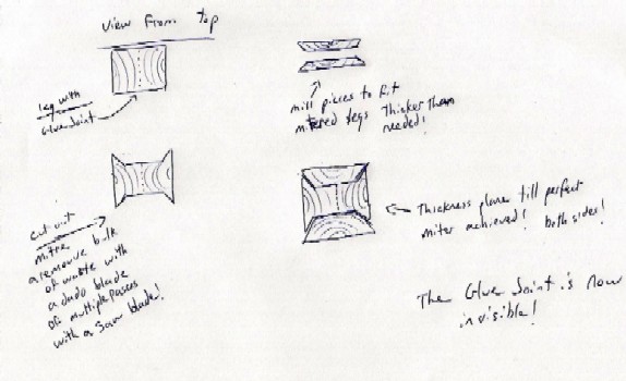
You can still correct your glue line. This can be achieved by adding a thin piece to either side of the leg, thus covering the glue line. Mitre the sides with the glue line and remove the bulk using multiple passes with the saw or a dado set. Mill up thin pieces to width and a little thicker than the depth of the housing, glue in place and thickness plane. All you’ll notice is a mitred joint!

Click here for higher quality, full size image
From contributor Y:
If I read your post right, you've already glued them together? If so, an easier way than contributor C's is to veneer the side with the glued edge. The thinner the veneer, the less noticeable the remaining joints will be. In addition you can finesse the shaping of the corners to make even that disappear.
Having just done a lot of four-way locking miters (with a router table), I can not recommend it unless you have very stable wood, lots of clamps, and keep them short.
In either contributor L's diagonal method or the flat glue up, make sure the grain runs in the same direction of expansion - i.e. flat sawn to flat or quarter to quarter, because flat sawn expands a lot more than quarter. Rift is usually best. For that reason, if I had a choice, I'd put the veneer on the quarter sawn edges, but that's not generally the look one wants.
From the original questioner:
I thought about having a stainless steel vine pattern design made to go over the glue line or maybe a vertical inlay of ebony. Any thoughts?
From contributor C:
When designing furniture I ask myself what embellishments I can add. How will this make the piece more attractive? What separates a good craftsman from a great one is not that he doesn’t make mistakes... It's how well he hides them!
From contributor B:
Contributor C is spot on. I forgot that method, yet I used to do it when I was an employee working for an old-timer (many moons ago). On a humorous note, the old-timer, Jack, used to bum cigarettes from the guys, then not light them. He chewed them instead!
From the original questioner:
I think that means go for it! Thanks for the help!
From contributor W:
Why not celebrate the glue line by using a contrasting veneer in the glue joint (walnut with maple, oak with walnut). I have done this numerous times on chairs with square legs. Very well received. I have even offset the glue line by 1/4 - 1/2 inch to create interest. A buddy even used the idea on a set of 4 sided miter legs.
From contributor L:
Good points - my furniture design teacher taught me many things, such as "details are there for a reason" - meaning, sometimes, that they cover mistakes, and "if you can't hide a joint, emphasize it" - make it look like part of the overall design.
